► Touchscreens dominate car interiors
► But are they better than buttons?
► We’re not convinced they are…
Look around most car showrooms, and you’ll see premium models with interiors rammed full of touchscreens. Persistent switchgear is out – and ever-expanding screens inviting us to prod and swipe are in. The technology isn’t new: it’s been in our smartphones, tablets and even kitchen hobs for a while now, but it’s becoming the norm for high-end car interiors. And I’m not sure that’s a good thing.
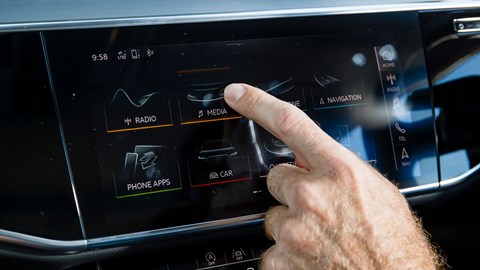
Take our Audi A8 L long-termer, for example. It’s the pinnacle of Audi technology – both in and out – but its tactile interior is actually a solid step backwards. For the last few years, Audi has produced some of the most usable, classiest interiors around, with precise, intuitive MMI controls nestled exactly where your hand naturally rests. It was simple, easy and effective – but now it’s all gone a bit Starship Enterprise.

On the surface, the new A8 interior is neat, tidy and futuristic. When switched off, its black infotainment panels lend the interior a super-high-end feel, and when on, they’re bright and offer superb contrast. When you’re parked with nothing to do, they’re a fun and impressive bit of kit – but with the wheels rolling, they’re the wrong tech at the wrong time.
What is Audi’s virtual cockpit?
Without persistent controls, you need to glance at the screen more often, and while haptic feedback is good it always requires slightly more pressure than you’d expect. That all means more time and attention diverted to sorting the infotainment system, and less for actual driving.
We praise head-up displays as they allow us to do the exact opposite.

Operating the new-fangled MMI Navigation Plus with MMI Touch (quite a mouthful, tellingly) isn’t that intuitive, either. When using the touchscreen, you either keep your arm floating in the air – which gets tiring after a while – or you use your fingers to anchor your hand on the dash, and make your thumb swipe through screens. It’s a far cry from the easy, relaxed operation of good old-fashioned physical buttons.
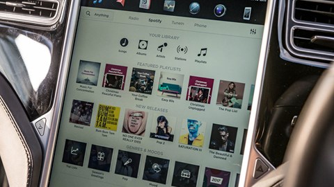
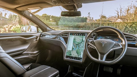
I’ve picked on our Audi A8 L, but it’s a problem that runs through most touchscreen-centric cars, including the Tesla Model X and Model S, too. I’m a fan of touchscreens everywhere else – I enjoy a swipe as much as the next person, but it feels as though the use cases are very different.
Phone, tablets and other electronics can consume all of our attention, and they’re just as much about an engaging user experience as they are about completing the task at hand.

On the road, however, it’s all about getting things done quickly, safely and efficiently – whether it’s inputting an address, changing the heating or making a hands-free phone call. It’s not How cool it is to pinch and zoom on Google Earth. With that in mind, touchscreens can be a great solution – just not the sole one for cars.
What is a head-up display?
It’s easy to see why Audi has fallen for this latest digital craze – touchscreen tech gives any cabin a wow factor, and it’s the latest must-have trend – but it’s gone about it the wrong way. Mercedes’ MBUX and BMW’s latest iDrive system both offer rich, engaging touchscreens, but in addition to an easy-to-use trackpad or physical dial. Why Audi has gone all in with touchscreens remains to be seen.
Either way, it looks like we’re stuck with touchscreen mission creep. Just like every other Audi innovation, the tech is slowly trickling its way down into every new, premium model the brand announces, from new A6 and A7 to the latest Q8. Has Audi squandered its solid platform with tech for tech’s sake, or do you prefer touchscreens after all? Let us know in the comments below.