- Lexus Link media system tested
- It junks the old trackpad…
- …but is it actually better?
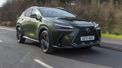
It felt like a very welcome revolution was coming when Lexus announced a new infotainment system. The old one was incredibly fiddly and confusingly laid out, and made you use a square trackpad or something resembling a mouse from an old PC to direct a cursor around.
Now, debuting with the latest NX, here is Lexus Link, available in two sizes: the 9.8-inch Connect and the 14-inch Pro. We’ve tested the Pro version.
Lexus Link introduces very 21st century features including over-the-air software updates, a natural-speaking voice assistant and live traffic updates. Wireless Apple CarPlay and wired Android Auto are options. We had some connectivity issues with two Android phones that needed pairing from scratch every time via Bluetooth – but that could be our phones’ bad communication just as much as any oddity with the car.

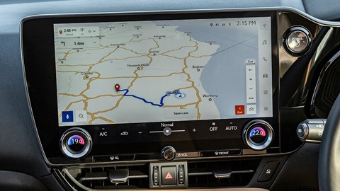
Lexus says the Pro system has one of the biggest touchscreens in the NX’s mid-size SUV segment, and it certainly looks massive. There’s a small sidebar on the driver’s side for quick access to the most crucial services (media, nav and so on) but, interestingly, there’s no conventional home screen. That’s a disadvantage when you want to change some settings, requiring more screen tapping than would be necessary with a home screen. There is a quick-access menu, but it’s mainly for safety tech that doesn’t have a physical switch elsewhere in the car. The climate controls, too, are hidden away, with very few physical switches and buttons remaining – the temperature dials and the volume control, for instance.
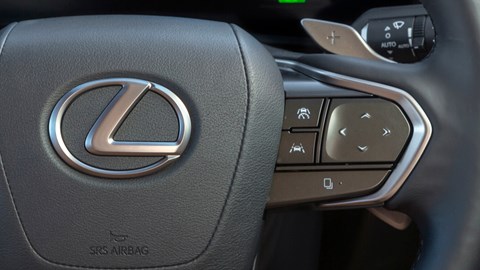
That’s where the new touch-sensitive buttons on the steering wheel come in. They’re unmarked and configurable. You rest your finger on them and a graphic appears on the head-up display to show you what function each one performs.
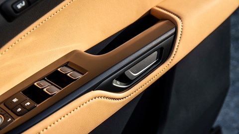
Lexus also seems to have unnecessarily reinvented the door handle with ‘e-latch’; the idea being that you press the door latch inwards and the car checks the blind-spot monitoring to make sure you’re clear of any hazards before allowing you out. You can over-ride it, of course. But both just seem unnecessary – what’s wrong with physical steering wheel buttons and a normal door handle? It’s as if the Lexus team needed to find an outlet for their zanier side, having been told to bin the trackpad.
Lexus Link: how it works

Poke ’n’ prod
Hurrah! No rubbish trackpad! The touchscreen is bright and crystal clear, even if it can look rather sparsely populated in terms of actual content

Wheely daft
Unmarked, configurable steering wheel buttons take ages to get used to. Like Tesla’s unmarked scroll buttons, these seem to be different for the sake of it

Thumb it in
New NX cabin also features ‘e-latch’ – door handles linked to blind-spot monitoring to make sure you’re not going to open the door into something
Lexus Link: does it work?
Kind of. It’s a massive improvement on the older, clunky systems used by Lexus but it feels like it’s still a few software updates short of greatness. And Lexus has still managed to include some unnecessary complications.