► Ford’s latest infotainment tested
► New Sync 4 debuts on Mach-E
► Our first try of new system
We can’t yet tell you how Ford’s all-electric Mustang Mach-E SUV drives yet – but we’ve had a good hands-on opportunity with the latest infotainment system, Sync 4, in a static Mach-E. Sync is Ford’s infotainment software, which started out as a tiny screen buried deep in the dashboard of a Fiesta in 2007, and has since morphed into Sync 3 – a decent if slightly clunky offering adorning all Ford’s passenger cars and most of its vans.
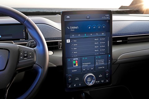
Sync 4, as previewed in the Mach-E, is a rather different offering, taking the form of a TV-sized touchscreen dominating the cabin and controlling almost all the car’s functions. The Mach-E’s screen is half an inch bigger than the one on the Tesla Model 3, at 15.5 inches – you can almost hear the engineers in Michigan giving a big yee-haw and high-fiving one another. However, Sync 4 will work on screens from just eight inches in size, so it can be applied to smaller cars too. It will start appearing in production Fords this year.
The layout’s a lot more traditional than Tesla’s, and with a few physical buttons round the cabin and a further screen acting as a gauge cluster, it doesn’t quite take over every function. The screen itself is bright, clear and responsive, the graphics crisp – it’s a good-looking display. It has ‘conversational’ voice-recognition capability too.
 The interface is based around a home screen with dynamic ‘cards’ – the car will learn your routine and adapt them accordingly. Drive home at 5.30 every day? Expect to see that route at the top of the nav when you get in for the evening commute. Penchant for a podcast on the morning drive? It’ll show up. In theory, this will just get better and more accurate with extended use.
You can split the display, too, allowing you to keep an eye on navigation in the top window while you choose music in the lower one, for example, although this feature isn’t on sub-12-inch screens.
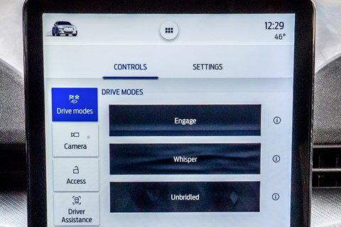
All very useful, but Ford’s taken another leaf out of Tesla’s book by hiding driving functions away in menus rather than having them front and centre on the home screen. Switching driving modes requires the driver to perform too many actions. Sync 4 also involves a lot of animations that aren’t quite as smooth as you’d expect in 2020. Still, as a step forward it’s a big one.
Ford Sync 4: how it works
One screen, one dial
Portrait-orientated screen features a volume dial at the bottom as its sole physical control

Not dead, but buried
Driving functions are accessed by hitting the car icon in the top left – it should be bigger

Your nav or mine?
3D connected nav looks good and works well enough. But it’s just as easy to plug in your phone and use navigation app Waze…
Ford Sync 4: does it work?
Yes – it’s a worthwhile upgrade that looks good and works well, although too many functions are several menus down. But the real question is whether anybody will use it, with wireless Apple CarPlay and Android Auto providing seamless connectivity with your phone.
Check out more CAR tech news here