► (Mostly) new Dacia Duster revealed
► Debut at Frankfurt 2017, on sale 2018
► Sticks close to the original Duster formula
The same but better. That’s what Dacia’s customers said they wanted in a new Duster, and that’s what Renault’s big-value Romanian brand has set out to give them.
On sale in the UK in summer 2018 (and earlier the same year in left-hand drive), the Duster looks very close to the outgoing model.
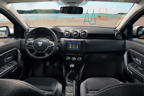
Dacia Duster 2018: it’s what’s inside that counts
Simple but not basic. That’s how Renault group design chief Laurens van den Acker describes the appeal of Dacia. It’s a fine distinction, and a debatable one, but one worth exploring. After all, Dacia has been one of the European car industry’s success stories of recent years. Its cars have sold in ever increasing numbers since its 2004 rebirth, and feedback from buyers tells the manufacturer it’s doing a lot right by pursuing a big-value, no-frills approach.
But that feedback did include a few gripes about the interior of the original Duster.
Van den Acker admits they have a point. ‘If I could allow myself a criticism of the previous Duster, if you got close enough you could smell the compromises we had to make.’ So for 2018 the inside has had a bigger overhaul than the outside. There’s a new (and repositioned) touchscreen. There’s an extra air vent. The seats are shaped for more comfort, and have a wider range of adjustment. The doors are plusher, and the previously centrally mounted window switches have now migrated to the doors.
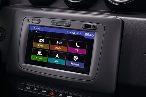
The dash now adopts a design that hides all the shutlines from view, boosting the perception of quality. And there are more stowage slots.
But the traditional handbrake remains, as does the manual driving mode adjuster.
Van den Acker is very pleased with the result, which drew on ideas from the Renault group’s operations around the world, although the interior was designed in France.
‘We’ve managed to fix lots of complaints from our customers – window switch location, screen height.’
‘It’s not a symmetrical interior. It’s more driver orientated. From the driver’s seat, it appears wider. There are clever secondary storage spaces.’
He’s particularly pleased with something that hasn’t changed its design: the simple but effective air vents. ‘Each one is one piece, not 12 pieces like some, and we use it five times. That saves money we can put into other areas. It’s a lot of car for your money – generally the price of other cars a size below.’
He adds: ‘Dacia is a brand that kind of established itself. Those are often the strongest brands. Nobody, including ourselves, saw the success coming. The brand was established by the customers themselves.
‘Sometimes we joke that the less we manage the Dacia brand, the better it goes. If we over-think it, we might screw it up.’
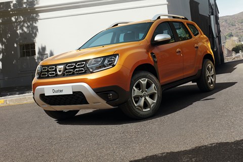
Few mechanical changes, carefully updated styling
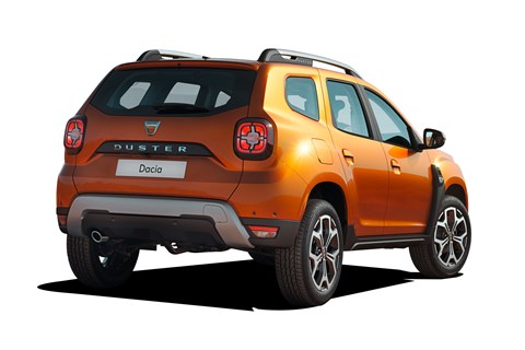
Outside the changes are more subtle. The grille and lights are new, and now more in line with the rest of the Dacia line-up. The lights, front and rear, have been moved further apart to make the car look wider.
Up top, the roof bars are now chunkier. Down below, the wheel diameter has increased by an inch to 17in, and the bash plate is colour-impregnated, not painted, so it won’t start to look acned after it’s taken a few knocks.
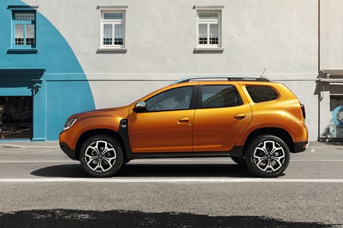
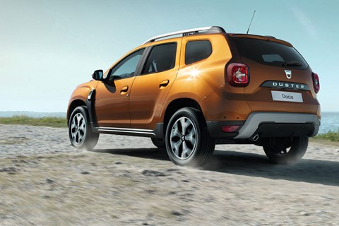
The biggest visual change is to the sides, where the proportions have been changed to make the glasshouse smaller and more shapely, with a different curve on the underside of the third window. The wheelarches retain their familiar Wrangler-esque chunkiness, joined by a fake vent behind the front wheel.
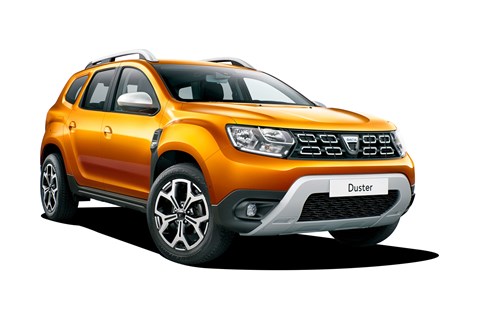
The lower edge of the re-angled windscreen starts 100mm further forward, creating a bigger glass area at the front, although the car’s width, length and wheelbase are barely changed, as are the engine and transmission choices.
Design director David Durand says: ‘It’s quite challenging to replace the Duster because it’s such an iconic car, very recognisable, with a true personality: honest, unpretentious, none too aggressive. We wanted to keep this personality but make it better.’
Group design chief Laurens van den Acker adds: ‘We could have started over and surprised everyone once more, but it’s not very often that you get the chance to build the following. We can do this with the Duster. Sales keep going up and up. You can build a car that is recognisable as a Duster, although we’ve changed every [visible] part.
‘Proportions are 60% of the appeal of a car. We’ve emphasised the strength of the front and the rear. The front end is instantly recognisable, but much stronger.
‘The skid plate says it’s a 4×4. The arches give a much better stance, and the rear lights now give better [boot] access as well as looking better.’
Why not follow the general trend to make an updated car bigger than its predecessor?
‘One of the advantages of the Duster is that it’s relatively light,’ says van den Acker. ‘From customers, there wasn’t that much complaint about size. Push it much bigger and you need bigger engines, heavier suspension. So instead we made sure we fixed the design mistakes.’
Durand says plenty of more radical design options were put forward from the Renault group’s design team’s around the world before the final work was done in Bucharest. But when a car is selling so well, continuity is more important than change.
‘Our guys all round the world tried all sorts of interesting things, some quite radical ideas’ says Durand. ‘They haven’t all reached the finished version but it’s good to look them over.’
Click here for more new cars from the 2017 Frankfurt motor show